A while ago we plotted time series data with Matplotlib. This worked nicely, but with the data at hand, a bar diagram would have looked much better. In this article I'll give you a template for using bar diagrams with time series data. This builds on the work we did last time, so please read my previous article for some background information if you haven't already.
Creating a bar diagram is pretty simple. Basically, all we have to do is modify the script to use plt.bar() instead of plt.plot_date():
import numpy as np
import matplotlib.pyplot as plt
import matplotlib.dates as mdates

days, impressions = np.loadtxt("page-impressions.csv",
    unpack=True, converters={ 0: mdates.strpdate2num('%Y-%m-%d')})

plot.bar(x=days, y=impressions)
plt.title("Page impressions on example.com")
plt.ylabel("Page impressions")
plt.grid(True)
plt.show()
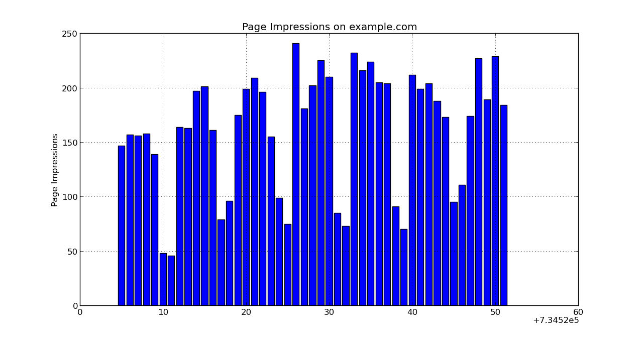
This plots the diagram, but there is one problem: The y values aren't labeled properly:
To fix this, we need to tell Matplotlib that x values are dates and how to format them using a Formatter. Additionally, to avoid crowding the x axis with labels, we use a Locator to only label Mondays (there are several other Locators, it depends on your data which is best). And finally, since date strings use up lots of space, we rotate them via autofmt_xdate().
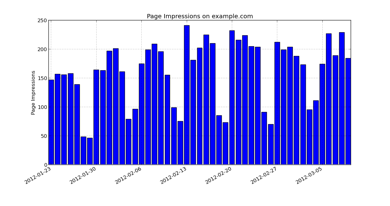
Here's how the final result looks:
And here's the script for copy and pasting:
import numpy as np
import matplotlib.pyplot as plt
import matplotlib.dates as mdates

days, impressions = np.loadtxt("page-impressions.csv", unpack=True,
        converters={ 0: mdates.strpdate2num('%Y-%m-%d')})

fmt = mdates.DateFormatter('%Y-%m-%d')
loc = mdates.WeekdayLocator(byweekday=mdates.MONDAY)

ax = plt.axes()
ax.xaxis.set_major_formatter(fmt)
ax.xaxis.set_major_locator(loc)

plt.bar(days, impressions, align="center")

plt.title("Page Impressions on example.com")
plt.ylabel("Page Impressions")
plt.grid(True)

fig = plt.figure(1)
fig.autofmt_xdate()

plt.show()
Note that the order of the API calls is significant and not really intuitive. It took me some time to experiment, but once you have figured it out it's pretty simple to change Formatters, Locators, and other labels.